About
/ABOUT
August 2026
The brief
Prisma Design Awards was preparing to launch in Cyprus, with ambitions to grow into an internationally recognised design award. The visual identity needed to feel credible enough for a serious award platform from day one, while remaining flexible enough to scale as the project grows.
The goal was not to build a full brand identity from scratch, but to create the minimum viable visual system needed for launch: a distinctive logo, type selection, colour palette, a signature gradient, and a set of photography assets prepared for the website. Fast!
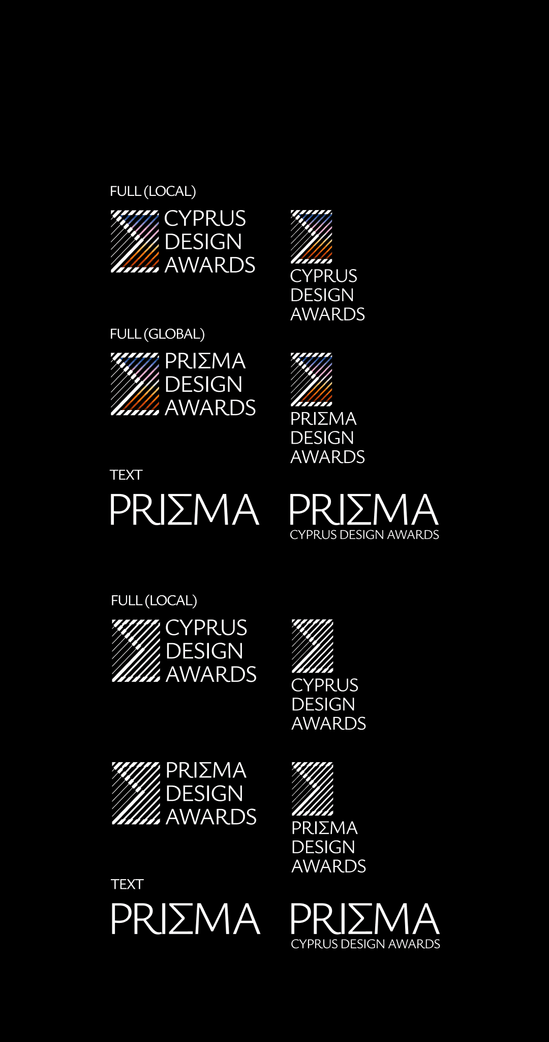
LOGO VARIATIONS

FONTS SELECTION

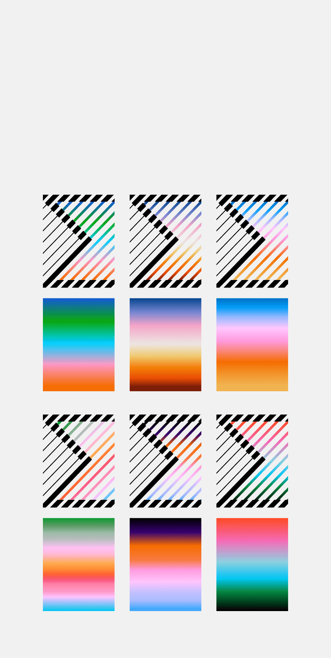
BRAND GRADIENT

GUIDELINES
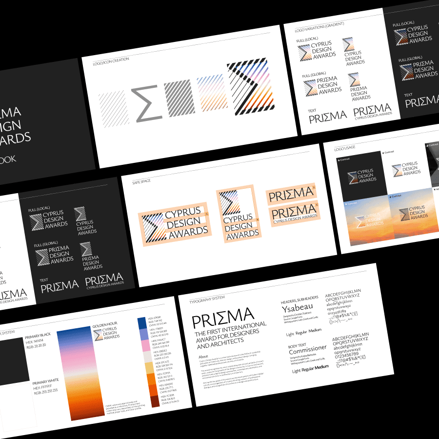
THE LOGO
The logo was the most challenging part of the project. The task was to move beyond the obvious visual interpretation of a prism and find a more distinctive way to communicate the idea of perspective, refraction and multiple points of view.
At the same time, the mark had to remain simple, recognisable and versatile across different formats — starting with the website and social media, but with enough flexibility to work across future brand applications.


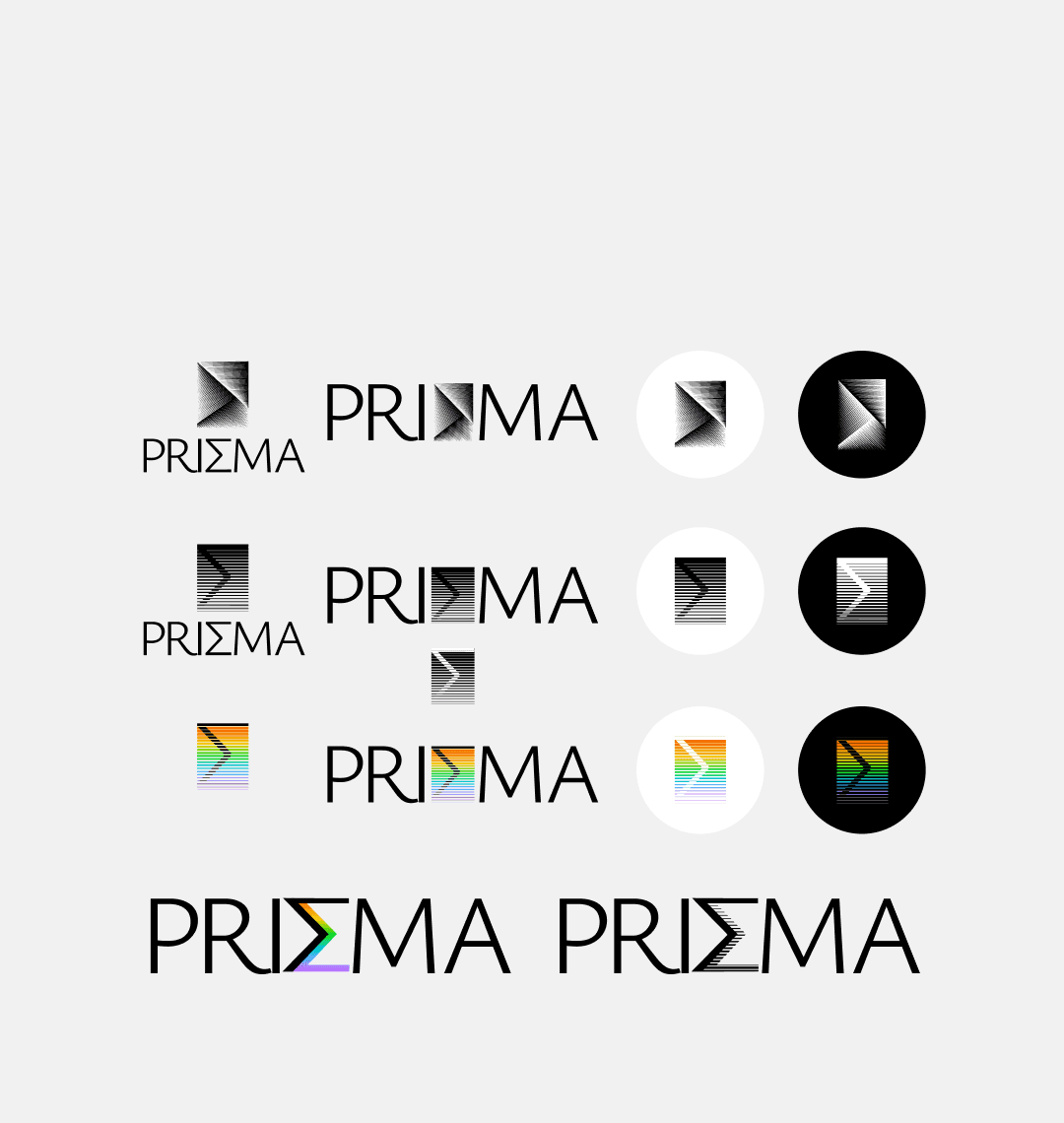
We explored multiple logo concepts before arriving at the final direction and developed a signature gradient as part of the visual language.
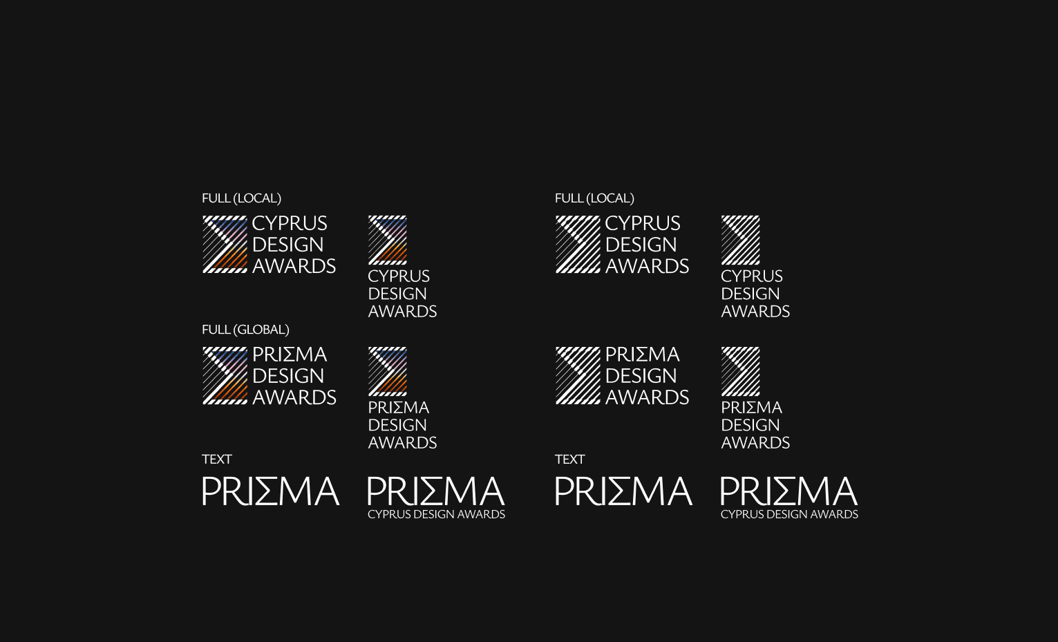
Rather than treating the logo as a single fixed asset, we built a system of versions around it: a local version for the Cyprus launch, a global version designed with future international expansion in mind, a typographic version, and multiple configurations combining the wordmark and symbol.
This flexibility was intentional. With print materials, event scenography, digital applications and other brand touchpoints planned for the future, the identity needed to work as a system rather than as one standalone logo.

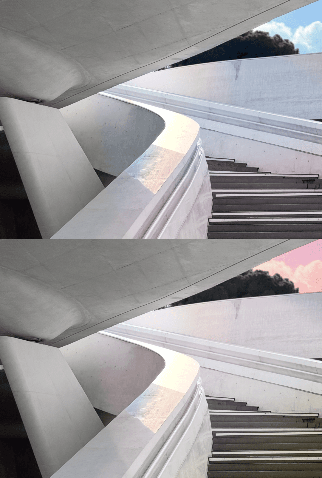
To complement the new identity, I also prepared a curated set of edited photography assets for the website and social media. Rather than introducing new imagery, I worked with photographs provided by the client, editing and adapting them to fit the new visual direction.
The goal was to make the existing photography feel cohesive with the identity and ready to be used consistently across digital touchpoints.